
Project Snapshot
In Taiwan, motorcycles are daily transport, and serious riders already keep records: fuel logs, service receipts, expense notes spread across apps and paper. None of it answers the question that actually matters, which is when to act.
MobiCha is a side project I co-founded with a software engineer: a rider-facing tool that centralises maintenance, fuel and expense records, then turns them into condition readings and proactive reminders. We built it for high-mileage and multi-vehicle owners, the riders who generate the most records and still run on guesswork.
Result
MobiCha was validated through structured testing rather than a public launch. Five research pain points converged into a three-layer system, which we tested through remote usability sessions, expert reviews and guerrilla rounds, then built to completion.
5 → 3
Five pain points became three product layers
3
Rounds of testing: usability, expert review, guerrilla
Built
Fully developed with one engineer, unreleased by choice
Problem
Existing tools let riders log everything: fuel, services, repairs, costs. What they never produce is a signal.
Two of the five pain points from research pointed at the same gap: no early warning before a breakdown, and no way to read vehicle condition at a glance. The missing layer sits between the record and the decision, knowing what needs attention and when. That is the layer MobiCha was built around.
From records to signals
Decision 1 — Minimal input over complete data
We considered structured, detailed entry to feed more precise analytics. We chose minimal input with inferred defaults instead, because riders log irregularly, and any friction at capture starves the system of the very data it depends on.
Decision 2 — Usage-based reminders over fixed schedules
Service reminders could simply run on calendar intervals, which is what most tools do. We based them on mileage, service history and part lifespan, because a fixed interval is always wrong for a high-mileage rider: it fires late exactly when it matters most.
Decision 3 — Multi-vehicle from day one
A single-vehicle MVP would have been simpler to build. We supported parallel maintenance timelines from the start, because research showed multi-vehicle owners carry the densest version of the problem and are the most likely to keep using the tool.
Solution: Capture, interpret, prompt
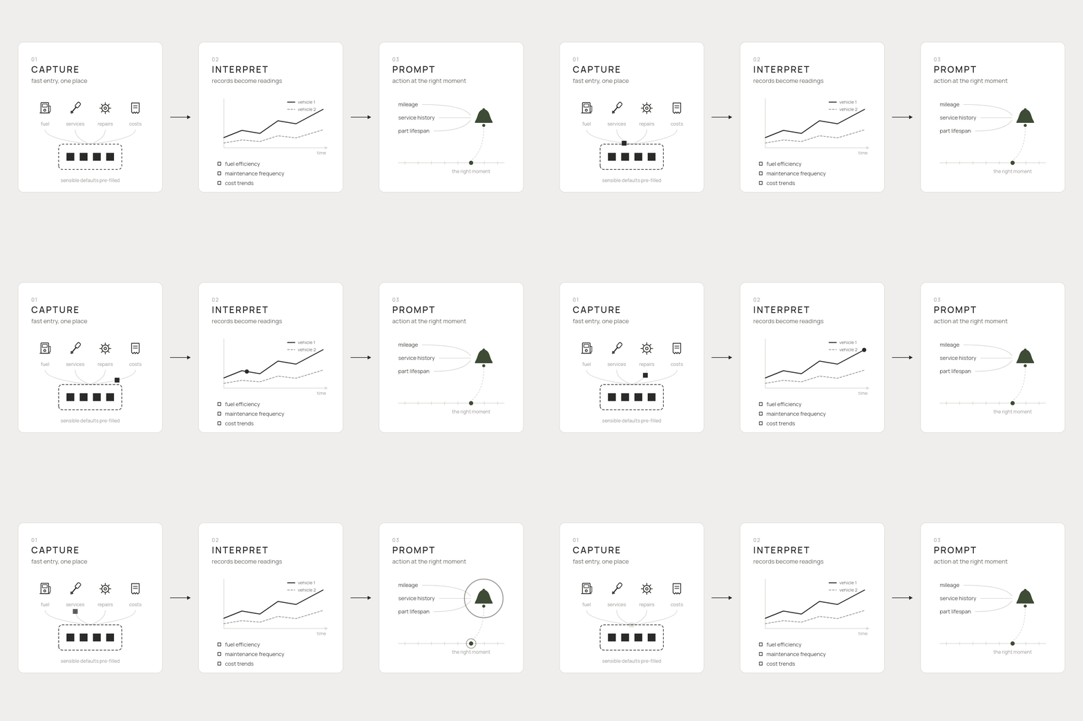
The system runs in three layers:
Capture keeps every entry as fast as possible: fuel, services, repairs and costs land in one place with sensible defaults.
Interpret turns those records into readings a rider can compare: fuel efficiency, maintenance frequency and cost trends, across vehicles and across time.
Prompt pushes an action at the right moment, with reminders calculated from mileage, service history and part lifespan. The MVP scoped each layer to its thinnest usable version.
Three layers in practice
Feature 1 — Rider Dashboard
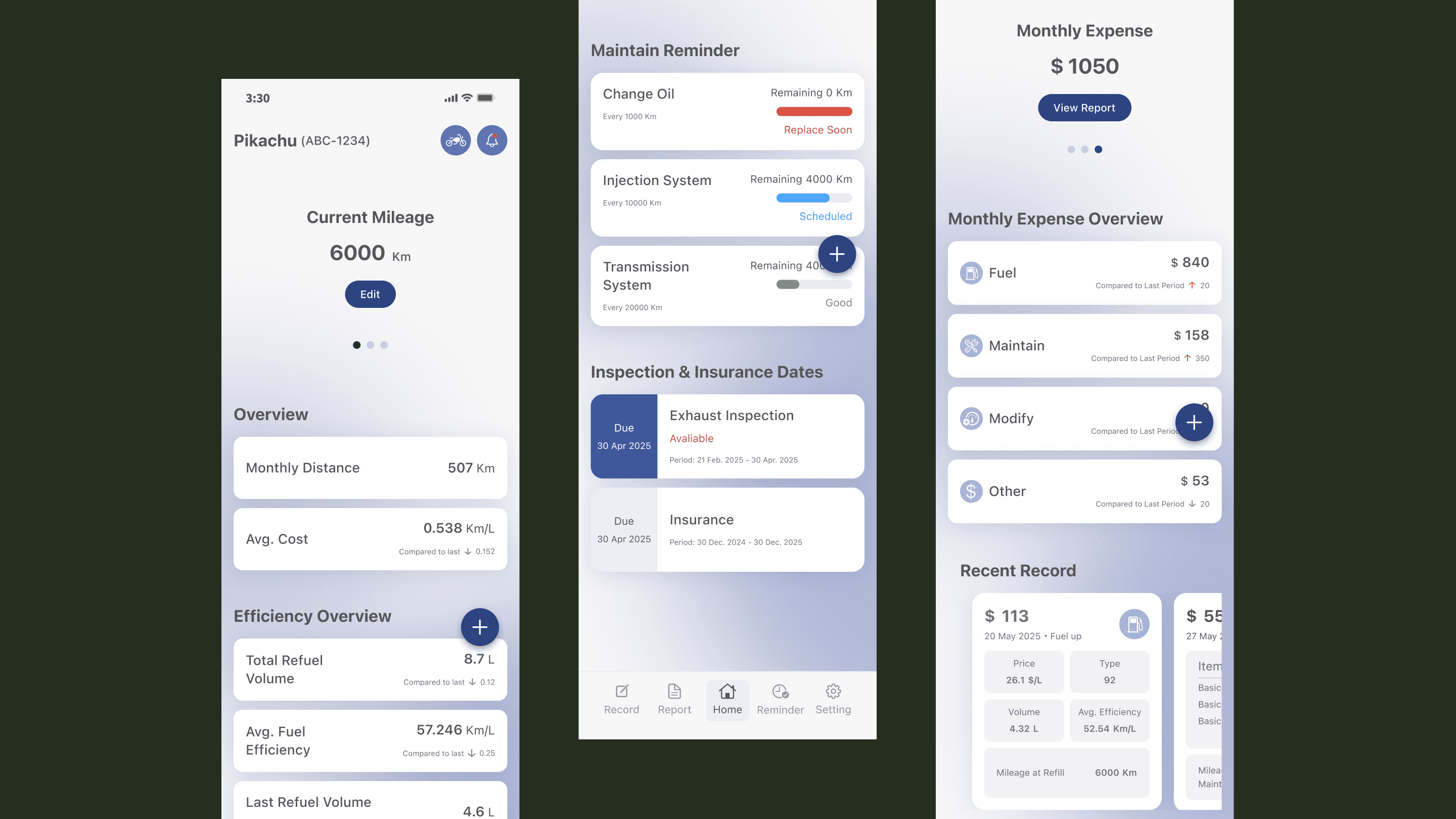
One view concentrates operational visibility: vehicle condition, upcoming services, insurance and spending. The decision point was what earns the first screen. We led with what needs attention and kept raw stats one level down, because a rider opening the app is usually asking a single question: does anything need doing.

Feature 2 — Vehicle Analytics
Analytics covers fuel efficiency, maintenance frequency and cost trends, comparable across vehicles and across time. The decision point was which metrics actually change behaviour. We kept the set small: a trend a rider cannot act on is decoration, and every extra chart makes the useful ones harder to find.

Feature 3 — Maintenance Alerts
Alerts run on usage rather than the calendar: mileage, service history and part lifespan. The decision point was the threshold. Fire too early and the reminder becomes noise a rider learns to ignore; fire too late and it fails at its one job.

Try the flow
What testing changed
We ran remote usability testing on Maze, two expert reviews covering user flow, UI and information architecture, and guerrilla testing on the iterated screens.
The clearest changes landed on the first screen and the fuel flow. Riders cared little about mileage on the dashboard, their instrument panel already shows it, so the oil change reminder moved up. The fuel entry flow now auto-fills fuel type and brand, since riders rarely switch either.
Outcome
The app was fully built over roughly six months with one engineer. We decided against an App Store release: launching would bring maintenance and operations neither of us could commit to alongside full-time work. It stands as a finished side project, and its value was the operational thinking it let us test end to end.
Reflection
Logging is a cost; the signal is the value.
The starting point for an ops tool is the decision the user has to make, and every data field has to earn its place against that question. Our best fix came from asking what a rider actually decides on opening the app.
